apple

Your 2013 WWDC Forecast

9 June 13

Time for WWDC predictions. Again, by the International Treaty of Apple Bloggers and Technical Union (UN Resolution 561/652B), I am legally obligated to disclose the forthcoming predictions.

iOS Devices

Zip. Nothing. Nada.

Mac Portables

We will see a general refresh of the MacBook line, with incremental processor upgrades to the MacBook Airs, but more significant changes to the MacBook Pro line.

The Airs will have run a new Haswell chip set, a Core i5 at speeds probably starting around 2.3 Ghz. They will also get a bump in battery life, possibly an extra 2 hours. They will not be touch screens.

The Pro line is due for some pruning. The 13 and 15 inch non-retinas alongside 13 and 15 inch retinas appears to be overkill. Apple might drop the 15-inch non-retina. I’m inclined to think they’ll keep the 13-inch non-retina, because it’s a good education machine and a good base model for the pro line, and they just made some price changes to it. A new 15-inch retina MacBook Pro with low flash storage could fill in the price gap.

The 13 and 15 retinas should also get a Haswell chip set, at 2.5 and 3.1 Ghz speeds.

Mac Desktops

Apple is the one that brought the desktop personal computer into this world, and they’re going to be the ones to take them out. I expect a completely new replacement for the Mac Pro line.

There is, really, no clear reason to unveil a completely new Mac Pro. But we know that when Apple needed to comply with recycling standards in Europe a few months ago, the Mac Pro was pulled outright rather than altered. It was a big hint that a replacement was on the way. So with a good clue that the Mac Pro is in store for a re-vamp, what is it about the Mac Pro that needed changing?

The only pressing tech change needed is a couple of Thunderbolt connectors – that’s been the most lacking element of the Pro. Therefore, I don’t expect anything too radical from where we are today in terms of specs. Faster, absolutely, but within the known limits of the market.

The only real change that Apple can deem necessary is to make the Mac Pro a dream machine for the pro market while giving it new use cases, to expand into the pro-sumer market. So I think the most radical change will be in the area of the design. I expect the machine will be both a rack-mountable unit and a desktop unit in the same style of case. I can see it as aesthetically merging with a re-styled Mac mini, and also as it’s own thing. Apple must be tempted to make the mini and the Pro into one “line” of computers, given that they fill very similar needs for a lot of techie users.

It wouldn’t shock me to see the mini re-positioned as a mini Mac Pro, and then a physically larger but visually similar case for the Pro. Both would also be marketed under the same name.

I can also see the Mac Pro another way, designed more as a docking unit. Picture a Drobo-style case, with not only swappable drives, but swappable cards and even processors.

Does this get released at WWDC? Some people are highly doubtful, but I think this is the prime event to announce it, and it would be hard to see this machine being introduced at any other time and still have maximum impact.

Mac OS

Note the title. Not Mac OS X. I think Apple’s going to draw a line between “Mac” and “OS X,” and use the term “Mac OS” as a substitute for “Mac UI.”

The Mac OS doesn’t beg for big upgrades right now, but it does need some feature matching with iOS. It needs better iCloud support, first and foremost. It could use a cloud backup feature, more support between Mac and iOS iLife and iWork apps, Siri, and further development of the notifications panel.

I also think we’ll see, really for the first time, some new iOS features announced for the Mac OS simultaneously. I can’t say what, though. I just think thats how Apple would want to treat the two platforms going forward, as close cousins that get the same upgrades.

Snow Lion? Nah, that would tick off China. Lynx? Is that too much like Linux? Ocelot? It’d be fun to say, but kinda goofy. We may need to move on to a new subfamily. Mac OS Sleepy Kitten? The ads would be great.

iOS

Here’s where we’ll see the biggest stuff.

I think the biggest tech news out of WWDC will be iCloud. I also think it will be downplayed a little, and just folded into the capabilities of the OS. Marketing iCloud has not moved the needle. Just including its’ capabilities in what iOS and Mac OS do is a better strategy. See the article What is iCloud to get a fuller take on what iCloud could be. Just to add some details, I think we’ll get the Core Data issue fixed, and we’ll get iRadio and iBooks in the cloud.

Apple will also upgrade iMovie and iPhoto with photo and movie-taking enhancements to match or beat Samsung. They can’t let Samsung get a lead into consumer-level media creation. That’s Apple’s home turf.

Apple needs a device-to-device file transfer, and Air Drop is going to be it.

I also think the system preferences section could get a re-vamp with a more clear organization of settings. It’s been the same for a long time and needs clarification. I’d like to get some of these settings like Airplane Mode made into buttons on the home screen or in the notifications screen.

I hope the app and music discovery process gets a big kick in the butt. I’m a little confused why Apple uses just a one-to-one discovery system. You wind up with stuff like “You have one Fleetwood Mac song in your library? You must love all seventies soft rock that’s ever been recorded! Why don’t we constantly suggest it!” It would make more sense to cross-reference music libraries and say “we note that people who have both Item A and Item B also had Item C.”

The much-talked-about Jony Ive “influence” on the iOS UI will certainly be the most interesting thing to watch. You can lose the felt in Game Center, but it can’t lose it’s relevance. Green felt did communicate what Game Center did. If you remove the felt and give no context, that’s a mistake I don’t want to see. But I have faith in Jony and his team. And who’s to say that the changes don’t become part of Mac OS?

The “7” banner at WWDC is a huge clue for me. It looks like a new default background texture. I think that the look of iOS is about to get the Braun treatment. I also think that Helvetica will become the new typeface of Apple.

Another area to watch is iMessage. It’s been getting new features every time iOS gets a new revision, and I’m not ruling out that iMessage might go with wifi phone calls. That would be a huge thing, and it’s a matter of time before 3rd party telephony apps take the calling experience out of Apple’s hands. Either they grab calling back and tell the carriers to go suck an egg, or they let others take the torch.

apple

What is iCloud?

15 May 13

Apple hasn’t revolutionized an industry for nearly three years now, so it’s completely rational to say the company has lost it’s drive for innovation, and will soon go out of business. It was a good run. Hail Samsung and Google. Have you seen those Google Glasses? Pretty spiffy. Hard to beat that. Seven inch phones. Yeah, baby.

They’ll just shutter the stores and apologize to Google and Microsoft for all the trouble they’ve caused. Apple.com is available at GoDaddy. Intel can start making those chips that run hotter than the face of the sun again. Tim can get his job back at Compaq. Like the sands through an hourglass, so are the days of our lives.

But maybe, just maybe, something’s happening at Apple.

When listening to Apple’s April financial conference call, it was interesting to hear Tim Cook refer to Apple as “Hardware, Software and Services.” That was new. Apple has never identified itself as a services company. So, it seems that this last gasp of innovation may be coming in a new form. In services. Is that Apple’s next big thing? So it’s time to ask, again: What is iCloud?

Oh God, Not the Cloud Again

Cloud services do not inspire excitement. Google even suffers here, and distance themselves from any categorization as a “cloud services” company, even though that’s exactly what they do. Being pinned with the term “cloud” seems to cloak a company in ethereal dullness. Even the jazziest of jazz hands cannot energize cloud services. But like a lot of things Apple has gotten involved in, the landscape may look uninteresting for now, but Apple has a knack for taking a lackluster product market and eclipsing everyone’s expectations.

Fine… Whatever… What is iCloud?

It’s not an anachronistic question as it first sounds. For most people, they feel like they already know what iCloud is – it’s the successor to iTools, .mac and MobileMe. A collection of modest sync services, and some other knick-knacks here and there. It also has a history of technical issues and disappointment. As such, it carries a hint of futility unique to the Apple product family. Kind of an add-on and after-thought. At best, people may see it as a keep-up-with-the-competition product.

It’s not a product, though, is it? It’s a service. However, it’s currently being branded like a product, because that’s what Apple’s good at. The best at, really. Still, iCloud is not something you can buy. There’s no boxed product, there’s no download. There’s no material “thing” that embodies iCloud. That makes the world’s most successful product marketing company look awkward when they talk about it.

As apple.com says, “iCloud stores your music, photos, documents, and more and wirelessly pushes them to all your devices. Automatic, effortless, and seamless — it just works.”

After having personal experience with selling .mac and MobileMe, I can tell you first hand that Apple does a poor job marketing their internet services. They’re brilliant at marketing physical products, but they aren’t as certain with services.

They prove this by using the same, lengthy, pedantic graphic they’ve used for six years when describing MobileMe. You’ve seen it. Devices below, cloud above. Documents beam up, documents beam down. In talking about products, Apple has long followed the axiom that you talk about the benefits to a consumer, not the tech specs. The cloud graphic feels like tech. It feels like they’re showing me the wiring inside the box.

They also can’t describe what iCloud does in a single, straightforward sentence. That apple.com blurb above is two sentences, lots of words, contains five commas – and a dash. It isn’t very concise.

Reset

Let’s wipe our minds of what iCloud is “supposed to be” based on expectations and the history behind it.

Time for a new tagline. Here’s what iCloud is in a catchy phrase that’s easy to remember: “Everything.”

Your phone, your tablet, your desktop, your music player, your camera and your TV all share the same things. It virtualizes your computing experience and environment. No longer do you have to associate data with the computer it’s stored on. It provides the full Apple experience.

It’s got everything.

That’s what iCloud is.

Story Time

Back in 1997, the buzzword of tech was something called “Network Computing” whereby the PC would just be a dumb terminal, and all the data, programs and processing would take place on servers. The promise was cheaper computers, but the drawbacks were numerous: the internet couldn’t support the bandwidth, users didn’t like giving up that kind of control, and then everybody got uncomfortable with the concept of paying for the subscriptions that would be required to have access to your own data.

The idea never caught on. But for at least two years, the trade writers and pundits couldn’t stop talking about the subject. You know how that goes, once the tech press has a bone in their teeth, they won’t let go. You couldn’t go five minutes without hearing the term “Network Computing” and “wave of the future” jammed into the same breath. It was really very tiring. After two years of it not happening, they gave up.

At the time, Apple was thought to be preparing a “Network Computing” Mac, and many thought the original iMac itself was a “Network Computing” Mac. The “i” in iMac was explained as standing for “internet,” after all.

It seems certain that Apple developed some ideas and worked up some concepts, but no product ever hit the market. Apple has a long history of making sure users retain their own data, best exemplified by the continued adherence to purchasing music over streaming it. One could assume that this philosophy is why Apple never made a networked computing product. That, and the technical hurdles. Getting everyone off 56K dial-up was no small task back in 1997.

Now, we return to the present. Or, at least, when this was written. Close enough. Today, we’re still trucking around the bulk of our data on our hard drives. But ever so slowly, we’re putting more on the internet. Just a file at a time to begin with. We were emailing around files one by one at first, now we have Google Documents and Dropbox to store larger sets of files.

But then we get to iCloud. On iCloud, we store our iTunes music library and everything we’ve purchased through iTunes. That includes Apps. Or as us old-timers call them, programs. Plus, we store our photos through iCloud, Instagram or Facebook. On iOS, we store documents. All of the sudden, we’ve got the meat of our data in the cloud.

A Hard Drive in the Cloud

So, it’s just a hard drive in the cloud, right? As stated explicitly during the iCloud introduction, Apple believes it is “so much more.”

It’s hard to see beyond the storage feature of iCloud, but if you squint hard enough, you can start to make it out. First, you’ll notice the inclusion of app downloads. Not to be confused with the black sheep feature of iCloud, app-specific data storage.

Not to point out the obvious, but apps are not data. In the abstract sense, yes, of course they’re made of ‘data,’ but apps are naturally segregated by users and operating systems from data. So why put them in the the cloud? Was the world really begging for online app storage?

The next thing to look at is the app-specific data storage, or “core data” as it’s become known. Now, as Apple claims, you can transfer settings and files between devices and retain everything from one device to another. Granted, it doesn’t work very well at the moment, but they’ll get it right. So, today, the promise is that you can use any existing device to your specific preferences. Tomorrow, you could just as easily not download the app or the data and have it run back on the server. That’s what we called “Network Computing” a few paragraphs ago.

So there’s this whole virtualized aspect to our modern computing experience that’s just a single step away from being run on a server or “in the cloud” instead of on a local device.

As a case study, let’s look at the way iTunes works. Of all the aspects of iCloud we’re using today, we use the iTunes features more than most. The iTunes Match service creates a big cloud drive for our music collections. Our purchase history is stored in iCloud as “iTunes in the cloud” for music, movies, TV and books and the files can be downloaded at any time.

Try looking at iTunes as a hybrid Network Computing setup. All the media you need is on the cloud, and is available on demand. It’s played locally, often as it downloads, but taken from the network.

Additionally, have you noticed that most of the iTunes store is accessible by using a web browser? You have to go to the iTunes app for purchase and download, but the bulk of the store can be currently accessed from any browser.

Is that the next step we’ll see for iTunes? Will iTunes go all-cloud? It feels like that might be the case, soon. It certainly seems like Apple has been building up to it. But it hasn’t happened.

Apple is committed to local processing, aka apps, to make iTunes function.

Look Alive, HTML 5!

Okay, but we’re still talking about storage. What about the rest of the cloud, like web apps? By my account, Apple made a huge internal effort towards the web as an app replacement in the late-2000’s. We even got a sophisticated email app in MobileMe. Then they walked away from it, and the people involved moved on. The SproutCore project and the Hype project both came from people who had then recently left Apple, if you remember. Other clues are the way the company has made big investments in speeding up JavaScript, and of course the development of the Safari browser itself. Apple was alls et to go HTML 5 in a big way.

So why haven’t we actually seen Apple web apps? Well, we do have iCloud mail, and a richer apple.com site, but aside from that, the cupboard is bare. Apple has seemingly made the internal assessment that HTML 5 is not ready to run a full-featured, rich user experience. This isn’t a shock, as Apple is probably as picky a company that exists when it comes to the user experience. What is a shock is that Apple seems to be the only ones who have figured this out. Browsers cannot replace apps.

Billions of dollars are being invested in browser-based web apps, and at the head of the push is Facebook. They, more than anyone else, have invested both financially and structurally in the web as the platform. Tellingly, they also have started development on apps and even devices. Google has done much the same thing.

Apple’s assessment is that apps should be local, but data can be held in the cloud.

For the Third Time, What is iCloud?

Apple has a bad rep when it comes to the cloud. Lately, the common “wisdom” of the tech punditry is that Google “gets” the cloud, while Apple doesn’t. Apple understands the cloud just fine. What limits them is the infrastructure needed to deliver the cloud as they want to deliver it. They don’t want to deliver a Google experience, they want to deliver the famous Apple experience.

Billions of dollars are being spent building one of the largest networks of server farms in the country, across several states. However, for whatever reason, analysts and pundits are overlooking this server build-up by Apple. Maybe there’s a belief that it takes these servers to run iTunes downloads or something, despite the fact that Apple runs iTunes fine today without giant server farms. Ten years ago, Apple ran iTunes out of a closet in Cupertino.

So what do you need multi-billion-dollar investments in server farms for, if not to power an exponential increase in Apple’s cloud capabilities? Steve Jobs didn’t make iCloud his last product introduction because he wanted to keep up with Google. iCloud, as Tim Cook has said, is a strategy, not a single product. It’s not a sync service for calendar appointments or photo sharing. It’s a much bigger strategy than MobileMe ever was, and a grander strategy than Google can ever achieve.

So Spill It, Nostradamus

Apple wants to take all data and all apps into the cloud, to some degree. They want to run OS X at the base level of a device, and as a conduit for cloud data, moving the iOS interface as part of iCloud. They want to make the Apple experience a networked experience. The plan is to make iCloud function as an OS.

How do you make iCloud an OS, and more importantly, why? Well, you aren’t going to make iCloud a conventional OS in terms of it being fit to run a physical device. However, it will have APIs and a file system similar to any definition of a traditional OS.

As to the ‘why’ question, it’s the best way for Apple to deliver it’s software assets. By assets, I mean iLife, iWork, Final Cut, Aperture, Logic and even iOS and Mac OS.

By buying a device, a user will have access to the Apple software portfolio, and access to OS updates. The setup is likely very similar to Adobe’s Creative cloud, a service that has proven successful and profitable. After one year, Adobe is dropping boxed software and going all-cloud. They’ve seen the future. It’s also worth noting that Apple has recently hired the executive in charge of Creative Cloud from Adobe.

Apple’s software is top-tier in almost every category they make software in. iWork is the only real competition for Office, and by itself extremely valuable. iLife, even years in, has no serious competition as a consumer media editing suite. Mac OS is the best “pro” OS, and iOS is the best mobile OS.

Now, if you add in a more sophisticated sharing and collaboration system, where anyone with an Apple device can be guaranteed they can edit and/or view shared media and documents, and you suddenly have a new standard in collaboration far more appealing than Google’s web experience. It will be easy to use, it will work online or offline, and it will have Apple’s consumer clout behind it. One iCloud account gives you everything.

So a user not only buys a device, but they buy Apple’s software. Matching their superior hardware with superior software is what Apple is at it’s core, and ensuring a stable ecosystem of Apple apps for all users is the next stage in the Apple experience.

Now, let’s bring iTunes movies and music back into the picture, then add the next stage, which is likely iTunes radio and books. Over the horizon will be Apple TV. With all these features, iCloud doesn’t look quite as anemic as it does today, does it? It’s also moved beyond syncing to being its own computing environment. The device is no longer the master of data, it’s the cloud that’s in control and the device is taking it’s cues from there.

And Beyond

Fast forward ahead even further. In time, you could see an entirely new way you use your device. Local devices will essentially load entire apps from the cloud, like they do now, but will delete apps when local space is needed, and then re-loading them on demand. It will do the processing locally, and store large assets on the device, but it will load the executable code from the cloud. This way, apps will always be up to date and can off-load some tasks to the server hardware for processing. No longer will the processing power of the device dictate what can be run, and the storage space a limit on how many apps you can run.

A good example would be a spreadsheet. In this distributed internet computing model, you can change the data locally in a cell, and do quick, simple math. But large sorts or huge, complicated recalculations might happen remotely. It lets a mobile user have a desktop-like engine, and save on battery life in the process, since the local device won’t be stressed. When the user moves over to another app, the device freezes the spreadsheet and loads it’s saved state into the cloud, like a memory page swap.

2,700 Words Later

What iCloud will ultimately be is the operating system for users. OS X is, and will continue to be, the low-level and local OS in control of the silicon. Users, though, will be working through software delivered and maintained by iCloud.

That’s why iCloud is not a product, but a strategy. It’s a strategy to eclipse the competition, specifically Android, and deliver the kind of software that Google can’t. Google is not in a position to give users the experience that Apple can. Both in terms of ease of use and in terms of data privacy.

The service itself may be nothing new, in terms of the nuts and bolts of what iCloud is. There are certainly services and cloud ecosystems that match or beat the pieces of iCloud. Once again, though, Apple can offer a polished, easy way of taking advantage of all the things cloud computing can offer. They can do this as a behind-the-curtain service, and shield the customer from worrying about any of the tech behind it. It’s the next big Apple innovation, and bigger perhaps than anything they’ve done in years.

That’s what iCloud will be. Stay tuned at WWDC.

apple

How in the World Do You Make a Cheap iPhone?

25 February 13

The world has surely pressured Apple enough to produce a cheap iPhone, so it’s about time, right? I mean, hundreds of pundits and columnists can’t be wrong!

The reasons to produce a cheap iPhone have been covered elsewhere, but to simplify the explanation as much as possible, there are tons of customers in many countries (China) which are not willing or able to buy phones on contract. To expand, Apple needs a iPhone that can be sold at an affordable price without contract subsidies.

Sounds simple enough. Plastic case, lo-res screen, 6-hour battery. Done.

Finally, a short article

But not so fast.

Plastic cases? If cheap plastic cases could solve the cost issue, then the current aluminum case would have to be costing, what, twenty bucks? You save just a handful of pennies going to a plastic case. That is not going to get you to a cheap iPhone.

Okay, so a smaller battery and lo-res screen will do the trick. Just go cheap on the parts.

Here’s the problem with that idea. A cheap iPhone is going to be sold worldwide, and because it is, indeed, cheaper, it will be the new sales champ of the iPhone line. Already, the two year old iPhone 4S is the second best selling smartphone, and a cheap iPhone would do just as well, and probably much better. It will, like the iPod mini and iPad mini before it, start to out-sell the more expensive version, and become the most popular product they sell. The unofficial flagship of Apple. You can’t make your most popular product a piece of crap.

In other words, Apple needs to make the cheap iPhone share the same superior experience the current iPhone has. They can’t cut corners on the experience, by making a shorter-life phone with a screen years behind the times. The phone they must produce has to match or exceed the current iPhone in terms of specs and in terms of user look and feel.

So, no cheap iPhone, then?

The iPod begat the iPod mini and the iPad begat the iPad mini. The iPod mini was a smaller-capacity drive in a colorful, slightly smaller case. The iPad mini was a smaller size with a lower-res screen.

If we are looking at an iPhone mini as the progeny of the iPhone, and following Apple’s history, the two features that might be sacrificed are screen resolution and storage capacity.

The issue of screen resolution is an interesting question. If Apple wants to maintain screen resolution compatibility with existing iOS software, then there are three options. iPhone 1-3 classic resolutions, iPhone 4 retina resolution, and iPhone 5 tall retina resolution. The difficulty is that both retina resolutions are expensive, and the classic resolution is no longer acceptable to the average buyer.

In terms of memory, the storage capacity of an iPhone mini could be minimized, but an iPhone is sold in varying storage capacities, anyway. Would an 8GB iPhone save enough cost to bring the price down enough? Maybe, but it could also compromise the usability of the phone.

A phone with a classic-res screen, plastic case and 8GB. What we called the iPhone 3GS. Forget that. Apple is not going to re-make a four year old phone.

So if Apple isn’t going to go backwards in screen resolution, and be able to save money by cutting flash memory or make it a cheap case, what can they do?

Doing the iPhone Math

But what if we turned this on it’s head? What if we went the other way and called this the iPhone plus, as the rumors say? Why? What if it’s called the called the plus because it’s not smaller, but bigger?

The price of a larger display would be, in fact, cheaper. The larger battery that can go in a larger sized iPhone can be cheaper. Even the flash memory should be cheaper at the larger size. All the sudden, it starts to make sense. A cheaper iPhone is a larger iPhone, not a smaller one. You can use a retina iPhone pixel count on a larger scale screen, get good battery life, keep the storage up and even attract the big-screen phone customer.

So there’s the way Apple differentiates the product lines. A small, sleek iPhone versus a big, less expensive iPhone. So forget the iPhone mini, it’s going to be an iPhone plus.

apple

The Lost Apple Logos You've Never Seen

29 December 12

Recently, the resurrected imprint of BYTE Magazine was good enough to publish a PDF of Stephen Wozniak’s 1977 article introducing the “Apple-II.” It’s a fun little read, and brings back a lot of that era when computing was just a hobbyist pursuit, like ham radio or car customizing.

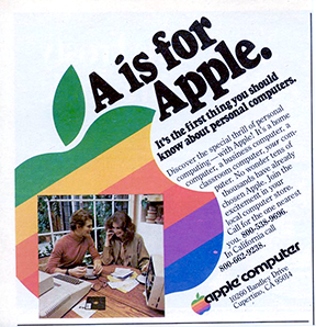
The PDF also includes one of Apple’s earliest advertisements, a three-page ad with professionally-shot and staged color photos of the Apple II in the home, being used by regular folks. It was the first time the computer tweakers’ world met consumer electronics, and it’s fascinating. But that’s not what interested me most, though.

What caught my eye was the logo. I’ve seen this ad several times in my life in looking over the history of Apple. But what escaped my attention until now was the logo artwork used in the ad. It’s different.

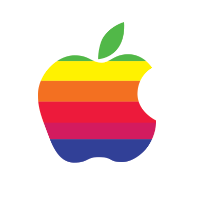
This one? After the ad copy? No. I’ve seen this one before. I have some old manuals that use the exact same artwork, 1981 reprints of 1977 manuals. The way to tell it from other rainbow Apple logos is that the green top is a little thinner than it should be, and the “chin” (if you imagine the apple bite as a mouth) is a little fat. Here it is, traced and color-corrected from the yellowing original:

As you can see, it doesn’t quite resemble the classic logo, as it’s stripes are a bit out of whack when compared the the badges on the computers. From what I can tell, this was the first “public” version of the logo, used on initial print materials. The next version of the logo, the classic rainbow logo, was used for the computer badges, but this malformed version remained in some print production materials for years. Oddly, Apple – a now-notorious control freak of a company – let it slide, as it appeared in various Apple publications and even ads through 1981. I assume this is due to the minor detail of it being 1977 and reproducing logos and graphics to exacting specifications is difficult and expensive. If only someone would invent a technology to make publishing easier!

I always called that typeface the “stormtrooper” font when I was a kid. I was bit deflated later on when I learned it’s real name was Motter Tektura. That’s a cool name for a font, but I like Stormtrooper better.

So, this logo was probably the first public appearance of the (near) final Apple logo. From what I’ve read, this brochure was wet from the printers when it was first used at the launch of the Apple II at the West Coast Computer Faire on April 17, 1977.

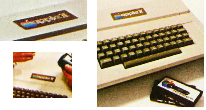
But anyway. That’s not what we came here for. The lost logos! The logos I’m talking about are the ones in the product shots. This one:

And this one, from a 1977 brochure, used to introduce the Apple II, from wikipedia.

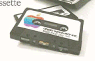
Take a good look at that logo on the computer. It’s not right. Then take a look at the cassette. It’s not right either.

Here’s a perspective-corrected version of the logo on the cassette, using a standard cassette label as a size guide.

Here’s a second take of the cassette, from the 1977 Apple brochure. It appears to be from the same product photo shoot.

And then corrected:

The Apple appears a bit wider, the leaf is split into two different colors, and the rainbow colors are in an entirely different arrangement. In the second shot, they even appear to be at a slight angle. Actual Apple Computer, Inc. cassettes in 1977 had a monochrome label. By 1978, the cassettes matched this design, but with the now standard rainbow logo.

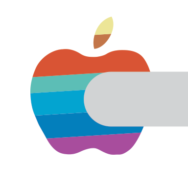
I assume these are an in-progress versions of the logo, before it was completely nailed down. As a former production artist, I can tell you that the process of finalizing a design takes a long time and many, many, many versions are tossed about before a final is arrived at. There’s also a good chance that these were hand-made mockups of the logo, just for the photo shoot. Here’s what it looks like, cleaned up, keeping true to the shape and colors.

Aside from the obvious shape difference, the color arrangement is entirely unique. Is this because it’s a one-off job for the photo shoot? Could they be the same logo in both shots, just a bit “off” due to photography, duplication and printing variances?

If it is the same label, and it it isn’t a one-off, here’s an educated guess as to how it was supposed to appear, free of distortions:

Now let’s take a look at the computer images. Here’s a perspective-corrected image of the logo on the computer, using the typeface as a size guide. From the ad:

And from the brochure:

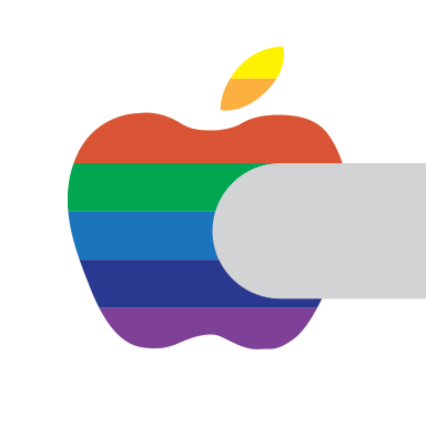
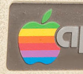
Then, let’s clean up this logo badge for the Apple II (or, in the parlance of the day, the Apple ][). A cleaned-up version of the computer logo:

The leaf is hard to figure. It might be orange, it might be a divided yellow/orange like you see in the cassette logo. It could also be metal, like the “apple ][“ type. Going by the photos, it does not appear to be red to match the top stripe. I’m going with the cassette version. Even if that’s just a glitch in the reproduction, the more interesting element is that the same rainbow color sequence from the cassette appears on this computer’s badge.

So we have two apples that both have the same unique take on the rainbow color sequence that’s become one of the most ubiquitous logos of our lifetimes. It’s safe to assume that these were early drafts of the Apple logo, at a time when the Apple II was still in testing and the units themselves were in a prototype stage.

By using the definite shape from the cassette logo, and the colors and from both the cassette and computer badge, along with the “bite” from the badge, here’s a fair recreation of what the Apple logo looked like in the prototype stage. This is the lost logo.

Yikes. That is a shock to the system, isn’t it? It’s like we got beamed into some alternate reality where Apple was run by some guy named Rick, disco never died and everybody has goatees. The color arrangement is a bad match for a traditional prismatic rainbow, and with emphasis on blues and green, it doesn’t make an impact. “Red Blue Green” colors would have been a way to emphasize the Apple II’s color TV capabilities. The split leaf is not a good look, either. It really washes out. There’s no doubt that this color sequence and color palette lacked punch. It was taller and wider than the final product as well. But as late as the time the photos for the brochures were made, this was more or less the Apple logo.

Here it is in it’s full form:

So wrong. But it’s an interesting footnote to the history of Apple. I’m calling it the “prototype logo.”

By the time the brochure went to print, the logo had changed to the “fat chin” version of the rainbow logo, and by the time the computers were in production, it had become the classic version we remember today. But how close was this to being the final logo? Close enough that they shot the Apple II and accessories for the crucially important introductory brochure with it.

That’s not all there is to talk about. Even after Apple had picked the right colors, the logo continued to vary in shape and color, as seen here in a well-known 1977-79 magazine ad:

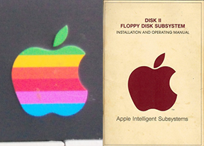
Here’s the logo as it appears on the 1978 Disk II, and the Disk II manual:

Here is the 1980 Apple III badge. You can see the “chin” still needs to go on a diet.

The logo evolved in slight and subtle ways even from the beginning. To just say the rainbow Apple logo had just one version is to not understand how it came about. You can clearly see that there’s a prototype logo, a “fat chin” version, and a few color variations from 1981 through 1997. That’s the real history of the Apple logo, and including this prototype adds to the story behind the most iconic logo of the last five decades.

A Review

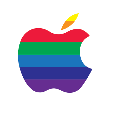
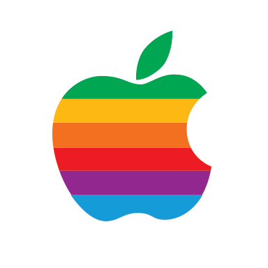
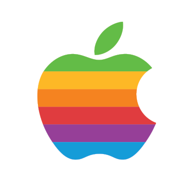
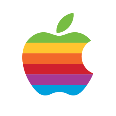
In 1978 through 1981, the Apple logo typically looked like this:

By 1983, the logo was a plastic badge that was under much more stringent quality control, and looked like this:

Can a logo be an old friend?

By 1997, the shape was the same, but the colors had been slightly changed. Doubtless this happened gradually over time. The red became darker and the yellow brighter.

Largely, though, the logo remained unaltered until the only guy who had the credibility to mess with it returned to the company. In 1997, the rainbow went away and it became “Aqua-fied.”

You can still see this logo on Apple business cards and on the building signs in Cupertino. It can also be red, green, purple, dark blue, light blue or orange. The red version is still used as the AppleCare logo.

A toned-down version would also be used for a brief period around the time of the G4 processors:

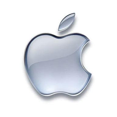
In 2003, it went chrome:

It’s the logo currently used in the Finder “About” box and on the iOS boot screen. However, since 1977, Apple has consistently used the identical silhouette design on almost all products and publications:

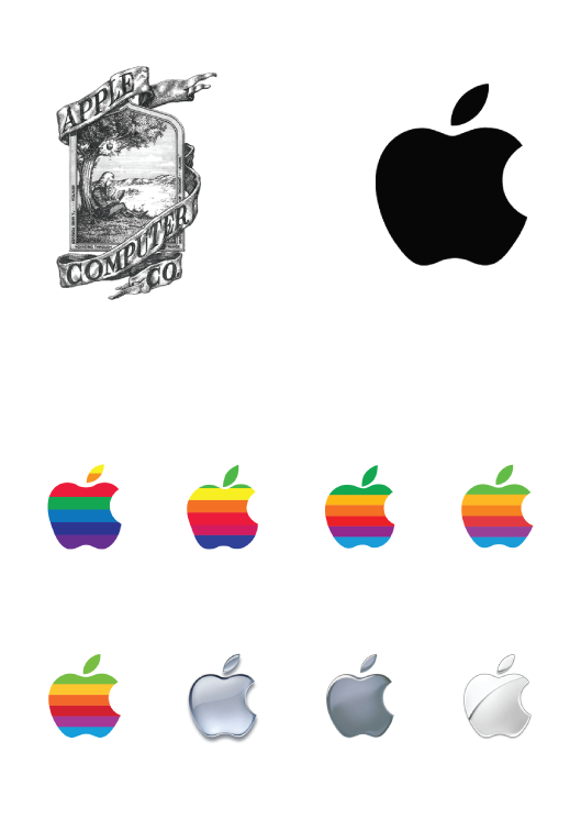
When you see histories of the Apple logo, you see a linear transition – old guy, rainbow, plastic, chrome. But time has proven that the Apple logo has had two principal iterations. The “changes” are just interpretations of the same basic design, with color variances that come and go. Essentially, the logo hasn’t changed since it was introduced in 1977.

It’s not as exciting, but here’s a revised history of the Apple logo:

So, it’s just two logos, and not nearly as interesting as other timelines, but it’s probably more accurate. Accuracy is often dull.

12/31/12 Re-write: Found a new cassette label and a computer badge, updated article. It forced a re-think and a re-write, but we have an even more interesting result.

1/14/13 Add: Thought further on the original prototype and made a new version based on the cassette logo shape.

Logos and artwork © Apple Inc.

apple

IPad mini event prediction autopsy

23 October 12

I did pretty well here, but a lot of this was leaked. I just picked the right leaks.

iPad mini

Name: right.
7-inch tablet: right. I didn’t intend to mean a specific 7-inch size, I was was just being general.
WiFi/cellular/3 memory configs: right.
For Sprint: right.
Black and White: right.
Retina: wrong, although a higher res screen than iPad 2.
New backlighting: wrong.
Price: big wrong.
Ship date: right.

I think the biggest shock for me is the price. I know that doing a smaller full-featured iPad would have been very tough to offer at $199, but I do think Apple has just ceded to low-end tablet market. Maybe the iPod touch will fill the gap. We’ll have to wait and see, but as it sits right now, this may be a major tactical mistake.

Retina 13-inch MacBook Pro

Retina 13-inch MBP: right.
Similar specs to the 15-inch: right.
Price: wrong. Off by $200.

Next Generation iMac

New iMac: right
Thinner: right
Same style: right
Optical drive removed: right.
No chin: wrong.
128GB flash drive: right.
Bigger screen: wrong.
New sizes: wrong.
No retina: right.
Prices and configs similar: right.

I was off on the sizes, but right on everything else. I even took a flyer on a 128GB SSD drive, and got that right.

Mac mini speed bump

Speed bump: right.
No other major changes: right.

Apple TV

Apple TV software update: wrong.

But Apple did add an Apple Events channel, so I might be able to weasel out on a technicality.

And one less thing…

No new iPad: wrong
No new processor: wrong
Stealth: wrong

Well, they did it. Apple revised the iPad inside of six months. Why? I don’t have a good answer to this one, unless Apple wants to move the yearly iPad release schedule to October, instead of April, and needed a refresh to carry the iPad over for a full year. Otherwise, it seems like an unnecessary upgrade. The 3rd gen iPad isn’t that slow, and there really was/is no demand for a faster model. The lightning port doesn’t seem vital, either.

I was also wrong that the Mac mini revision and Apple TV would be a stealth update.

Addendum

Price change/Config change: wrong

Again, why update and not change the price or memory sizes? A little baffling.

⬆ Newer
⬇ Older