


Recently, the resurrected imprint of BYTE Magazine was good enough to publish a PDF of Stephen Wozniak’s 1977 article introducing the “Apple-II.” It’s a fun little read, and brings back a lot of that era when computing was just a hobbyist pursuit, like ham radio or car customizing.
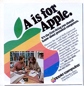
The PDF also includes one of Apple’s earliest advertisements, a three-page ad with professionally-shot and staged color photos of the Apple II in the home, being used by regular folks. It was the first time the computer tweakers’ world met consumer electronics, and it’s fascinating. But that’s not what interested me most, though.
What caught my eye was the logo. I’ve seen this ad several times in my life in looking over the history of Apple. But what escaped my attention until now was the logo artwork used in the ad. It’s different.
![]()
This one? After the ad copy? No. I’ve seen this one before. I have some old manuals that use the exact same artwork, 1981 reprints of 1977 manuals. The way to tell it from other rainbow Apple logos is that the green top is a little thinner than it should be, and the “chin” (if you imagine the apple bite as a mouth) is a little fat. Here it is, traced and color-corrected from the yellowing original:
As you can see, it doesn’t quite resemble the classic logo, as it’s stripes are a bit out of whack when compared the the badges on the computers. From what I can tell, this was the first “public” version of the logo, used on initial print materials. The next version of the logo, the classic rainbow logo, was used for the computer badges, but this malformed version remained in some print production materials for years. Oddly, Apple – a now-notorious control freak of a company – let it slide, as it appeared in various Apple publications and even ads through 1981. I assume this is due to the minor detail of it being 1977 and reproducing logos and graphics to exacting specifications is difficult and expensive. If only someone would invent a technology to make publishing easier!
I always called that typeface the “stormtrooper” font when I was a kid. I was bit deflated later on when I learned it’s real name was Motter Tektura. That’s a cool name for a font, but I like Stormtrooper better.
So, this logo was probably the first public appearance of the (near) final Apple logo. From what I’ve read, this brochure was wet from the printers when it was first used at the launch of the Apple II at the West Coast Computer Faire on April 17, 1977.
But anyway. That’s not what we came here for. The lost logos! The logos I’m talking about are the ones in the product shots. This one:
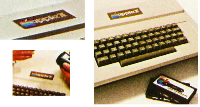
And this one, from a 1977 brochure, used to introduce the Apple II, from wikipedia.
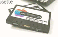
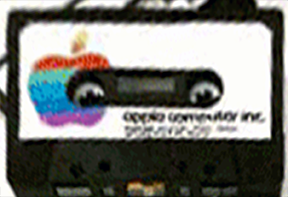
Take a good look at that logo on the computer. It’s not right. Then take a look at the cassette. It’s not right either.
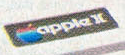
Here’s a perspective-corrected version of the logo on the cassette, using a standard cassette label as a size guide.

Here’s a second take of the cassette, from the 1977 Apple brochure. It appears to be from the same product photo shoot.
And then corrected:
The Apple appears a bit wider, the leaf is split into two different colors, and the rainbow colors are in an entirely different arrangement. In the second shot, they even appear to be at a slight angle. Actual Apple Computer, Inc. cassettes in 1977 had a monochrome label. By 1978, the cassettes matched this design, but with the now standard rainbow logo.
I assume these are an in-progress versions of the logo, before it was completely nailed down. As a former production artist, I can tell you that the process of finalizing a design takes a long time and many, many, many versions are tossed about before a final is arrived at. There’s also a good chance that these were hand-made mockups of the logo, just for the photo shoot. Here’s what it looks like, cleaned up, keeping true to the shape and colors.
Aside from the obvious shape difference, the color arrangement is entirely unique. Is this because it’s a one-off job for the photo shoot? Could they be the same logo in both shots, just a bit “off” due to photography, duplication and printing variances?
If it is the same label, and it it isn’t a one-off, here’s an educated guess as to how it was supposed to appear, free of distortions:
Now let’s take a look at the computer images. Here’s a perspective-corrected image of the logo on the computer, using the typeface as a size guide. From the ad:
![]()
And from the brochure:

Then, let’s clean up this logo badge for the Apple II (or, in the parlance of the day, the Apple ][). A cleaned-up version of the computer logo:
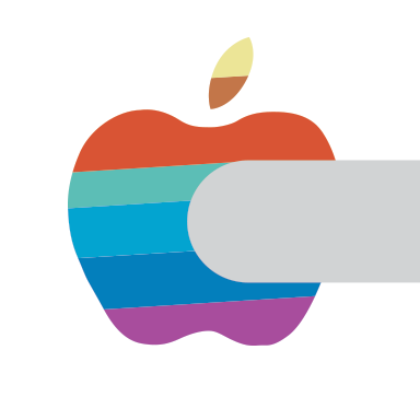
The leaf is hard to figure. It might be orange, it might be a divided yellow/orange like you see in the cassette logo. It could also be metal, like the “apple ][“ type. Going by the photos, it does not appear to be red to match the top stripe. I’m going with the cassette version. Even if that’s just a glitch in the reproduction, the more interesting element is that the same rainbow color sequence from the cassette appears on this computer’s badge.
So we have two apples that both have the same unique take on the rainbow color sequence that’s become one of the most ubiquitous logos of our lifetimes. It’s safe to assume that these were early drafts of the Apple logo, at a time when the Apple II was still in testing and the units themselves were in a prototype stage.
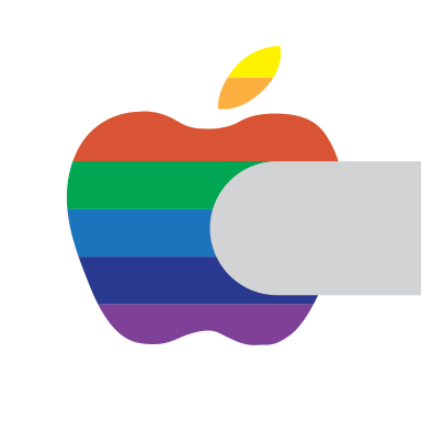
By using the definite shape from the cassette logo, and the colors and from both the cassette and computer badge, along with the “bite” from the badge, here’s a fair recreation of what the Apple logo looked like in the prototype stage. This is the lost logo.
Yikes. That is a shock to the system, isn’t it? It’s like we got beamed into some alternate reality where Apple was run by some guy named Rick, disco never died and everybody has goatees. The color arrangement is a bad match for a traditional prismatic rainbow, and with emphasis on blues and green, it doesn’t make an impact. “Red Blue Green” colors would have been a way to emphasize the Apple II’s color TV capabilities. The split leaf is not a good look, either. It really washes out. There’s no doubt that this color sequence and color palette lacked punch. It was taller and wider than the final product as well. But as late as the time the photos for the brochures were made, this was more or less the Apple logo.
Here it is in it’s full form:
So wrong. But it’s an interesting footnote to the history of Apple. I’m calling it the “prototype logo.”
By the time the brochure went to print, the logo had changed to the “fat chin” version of the rainbow logo, and by the time the computers were in production, it had become the classic version we remember today. But how close was this to being the final logo? Close enough that they shot the Apple II and accessories for the crucially important introductory brochure with it.
That’s not all there is to talk about. Even after Apple had picked the right colors, the logo continued to vary in shape and color, as seen here in a well-known 1977-79 magazine ad:
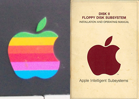
Here’s the logo as it appears on the 1978 Disk II, and the Disk II manual:
Here is the 1980 Apple III badge. You can see the “chin” still needs to go on a diet.
The logo evolved in slight and subtle ways even from the beginning. To just say the rainbow Apple logo had just one version is to not understand how it came about. You can clearly see that there’s a prototype logo, a “fat chin” version, and a few color variations from 1981 through 1997. That’s the real history of the Apple logo, and including this prototype adds to the story behind the most iconic logo of the last five decades.
A Review
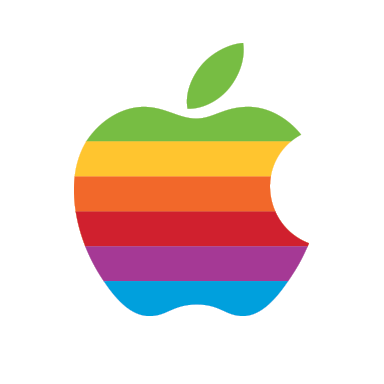
In 1978 through 1981, the Apple logo typically looked like this:
By 1983, the logo was a plastic badge that was under much more stringent quality control, and looked like this:
Can a logo be an old friend?
By 1997, the shape was the same, but the colors had been slightly changed. Doubtless this happened gradually over time. The red became darker and the yellow brighter.
Largely, though, the logo remained unaltered until the only guy who had the credibility to mess with it returned to the company. In 1997, the rainbow went away and it became “Aqua-fied.”
You can still see this logo on Apple business cards and on the building signs in Cupertino. It can also be red, green, purple, dark blue, light blue or orange. The red version is still used as the AppleCare logo.
A toned-down version would also be used for a brief period around the time of the G4 processors:
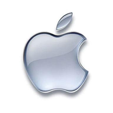
In 2003, it went chrome:
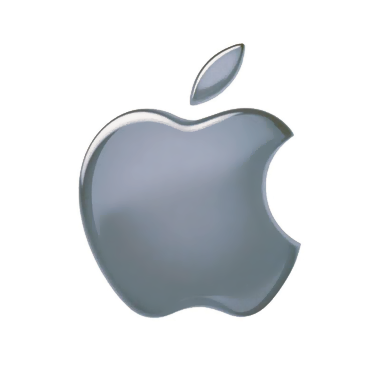
It’s the logo currently used in the Finder “About” box and on the iOS boot screen. However, since 1977, Apple has consistently used the identical silhouette design on almost all products and publications:
When you see histories of the Apple logo, you see a linear transition – old guy, rainbow, plastic, chrome. But time has proven that the Apple logo has had two principal iterations. The “changes” are just interpretations of the same basic design, with color variances that come and go. Essentially, the logo hasn’t changed since it was introduced in 1977.
It’s not as exciting, but here’s a revised history of the Apple logo:
![]()
So, it’s just two logos, and not nearly as interesting as other timelines, but it’s probably more accurate. Accuracy is often dull.
12/31/12 Re-write: Found a new cassette label and a computer badge, updated article. It forced a re-think and a re-write, but we have an even more interesting result.
1/14/13 Add: Thought further on the original prototype and made a new version based on the cassette logo shape.
Logos and artwork © Apple Inc.