In the beginning there were switches. Switches begat punchcards. Punchcards begat keyboards. Keyboards begat monitors, and lo, the text interface was born.
We looked upon the monochromatic glow of text and proclaimed it good. Then, in a time of famine and pestilence, we were blessed with the enlightenment of WYSIWG. At first, WYSIWG was called impure and sacrilegious. Flame wars raged! Many pixels were lost. Yet WYSIWYG, battered and beaten, survived – and it became the rule of the realm.
The reign of WYSIWYG brought with it the designers, and the designers created a new world of purity and light. This world they called the graphic interface, and to control it’s immense power, they created laws to govern it. These laws were the Human Interface Guidelines. The guidelines would herald this age of design, in it’s worship of icons. The icons allowed the illiterate to speak, and blind to see.
But little did we know the icon worshipers would bring with them the scourge of… Skeumorphsm.
Enough with that
First and foremost, the user interface of any program or app must be easily understood. Without that, the program is absolutely useless.
In earlier versions of Mac interfaces, we had a consistent design language. This design language was established with the original Macintosh, which fused concepts from artists as well as programmers. But the nature of this interface was not dictated solely by design. It was dictated by the constraints of the Macintosh. The Macintosh was a monochromatic screen, with fairly fat pixels by today’s standards. This meant that there were constraints on the interface: images had to be easily recognizable without color, and there was a strict limit on space to add any visual flourish. A look at the control panel of the original Macintosh tells you exactly what the designers and programmers were up against. They had tons of settings, but an extremely limited space in which to put them. They couldn’t put text in there even if they wanted to. There wasn’t enough space. They used the icon to help them with their space problem.
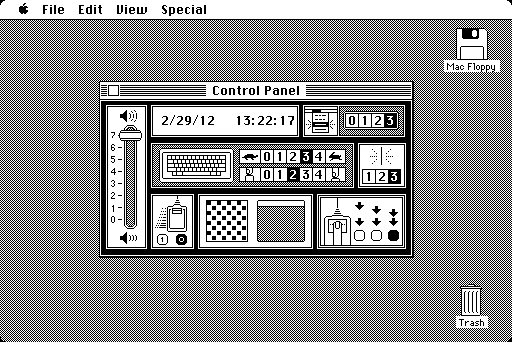
From MacFloppy.net
There was no room for detail, except for the very tiniest effects. You’ll find one pixel shadows under windows and under title bars everywhere on the original Macintosh. However, a one pixel shadow was all they had room for. Any more than that, and they would be running out of space. They would have to delete features, settings, or other vital parts of their interface for graphic design flourish.
This extremely economical design became a design language. Or, in other words, an interface. This interface was originally limited to checkboxes, radio buttons, text input fields, buttons with labels, sliders, desktop icons and window elements. In the early days of WYSIWYG computing, this was more than people ever dreamed possible, and more than enough to deal with early interface needs.
Then, as time went on, the screen resolution for the Mac became finer and finer. Eventually, color was added. The icons changed appropriately, adding shading and relief effects. Icons became much more realistic. They went from 16 × 16 to 512 × 512. As graphic rendering became more sophisticated, interface elements started to be almost photo-realistic.
With the advent of the Mac OS X Aqua interface, the interface design stopped so much being about pixel economy, and much more about graphic sophistication. By this time, there was far more real estate to work with, in a pixel density sense, and a new wave of innovation in interface design. Just about everything became shiny and lickable. It was almost literally, a new frontier for designers to work with.
But even at this point, interface elements were still holdovers from the original Macintosh. There were still radio buttons, checkboxes, large buttons with text, and all the other elements we were familiar with. Because of the original Macintosh’s brilliant and inspired interface, designers clung to it’s familiar and proven visual language.
Meanwhile, the graphics capabilities of every day computing continued to escalate. Storage capacities on computers continued to rise. Speeds continued to multiply. Pretty soon, the graphics sophistication of your average computer was growing by an order of magnitude beyond what most designers were ready and prepared to use.
At the same time a new variant of this visual language was developing, the mobile visual language. This mobile interface language was a cross between the old-fashioned need for pixel economy on the small screens of handheld devices, and the graphics sophistication of a modern desktop computer. It also prompted a new way of interacting with an application, through the touchscreen interface. People were no longer using a digital device to control another digital device, i.e. a mouse to control a computer, but were touching the interface directly.
Although computers up to this point had been called “personal computers,” mobile devices truly are personal. You do one thing at a time, with your hands, with a device that is under your physical control. You hold it.
This makes the mobile device something different. It makes it an intimate relationship.
No, not that kind of intimate
In the real world users had previously shared such intimacy with smaller items, like an address book or notepad. Most people don’t just walk into an office supply store and buy any old address book or notepad, they buy a particular type of address book or notepad they are very familiar with, and like to use. They spend hours making decisions. Think about the anguish and angst that goes into finding the perfect moleskin notebook for some folks. That’s an intimate product. Now, mobile devices are filling this very same spot in users’ lives. In ten years, how many young kids will know that such as a thing as a physical address book actually existed?
So now, the need for pixel economy design in mobile devices has started to become irrelevant. High-resolution displays – AKA “retina” displays – brought photo-realism to your hand held device. An icon for piece of paper is no longer a rectangle with a 45° crease in the corner. It can look like a real piece of paper. It can have a grain, a watermark, have text, and show subtle folds and bends in the material.
This results in an interface that no longer has to be an interface. Buttons can still be buttons and checkboxes can still be checkboxes, because those elements of the interface are extremely effective and universal for users. Other interface elements, though, can now be literal. No graphic metaphor is necessary. A color palette no longer has to look like a grid with colors inside, it can look like a real paint palette with splotches of color. Toggle switches can actually be toggle switches. A guitar can have real strings that vibrate. A ruler can look like it was made from wood.
But once you introduce photorealistic images to your interface, you start to step away from the traditional design of the graphic computer interface. Even though no one really set out at the beginning to create a graphic design style for the Mac or for iOS, a graphic design style is what we arrived at. It may not be written down in a style guide anywhere, but the traditional Macintosh WYSIWYG interface follows a certain convention that can be easily recognized as graphic design. It is a spartan and simple design, minimalistic and utilitarian.
With high-res displays, we no longer need to rely on aspects of design to communicate an interface. With hand-held devices, we now have devices that are far more intimate than the most personal of personal computers. Programs now can immerse you in their own environment, and because of the touch interface, it feels like you are actually using an object, rather than just controlling a program on a device. You no longer have a ‘virtual’ address book, you have a real address book.
Not only is skeumorphism virtually unavoidable at this point, but it makes the experience for the user a far better one. Interface elements look like real-world objects, and make a program much easier to understand and use. Photo editing software used to be taught in classes by professors. CD-ROMs were sold for hundreds if not thousands of dollars to teach you how to use Photoshop. Now, iPhoto makes an average user can a photo editor in a matter of hours. When brushes look like real brushes and tools look like real tools, learning is much faster and much more intuitive.
Skeumorphism works. Skeumorphism is effective. Skeumorphism makes the experience better for the user. Making the experience better for the user has always been the number one priority for Apple and it’s products.
So, even though people may not like the concept of skeumorphism, it is effective. Empirically effective.
But what about that goddamned leather?
Cheap pebbled leather is still cheap pebbled leather. That is a valid argument. But it is not an argument against skeumorphism so much as it is an argument against design choices. Consider the outcry against the Calendar app compared to the acclaim for the new Clock app on the iPad. People objected up-and-down to the leathered look of Calendar, to the point of rejecting it as an application and moving on to other choices because of how it looked. But when the new clock app for the iPad debuted in iOS 6, users had near universal acclaim for it. Was it because it was a better designed app? No, it was not. In fact, a user interface for the clock app is nearly nonexistent. It has very few options – it’s just a clock! But the design, nicked from the Swiss railway system, is a classic of modern minimalist design, cool and clean.
So the debate on skeumorphism is not so much a debate over whether or not skeumorphism is a good or bad thing, it is a debate over how it is applied in certain instances. Pure and simple. Some people just don’t like the way Calendar looks.
In Newsstand, iBooks and iTunes U, the wooden bookshelf is hailed as a appealing and attractive way of displaying items. It is entirely a skeumorphic interface. Objections to the Notes application seem to be concentrated to the typeface that’s being used. Complaints lodged against the Game Center interface focus on the felt background. So these are not objections against skeumorphism, so much as they are against the design choices made.
Every design choice made can be easily defended by Apple, because every design choice is made for the user to best understand the function of the app. Dark green felt may not be the most visually appealing thing in the world, but it is masterfully effective, and even clever at communicating what the app does.
Like it or not, this is the world we all live in now. It’s not a utopian design fantasy, it is a world much like the real world. Visually, reality isn’t particularly appealing most of the time. It is, however, very effective at communicating what things do. Hammers look like hammers. Trees look like trees. Chairs look like chairs. Some hammers, trees and chairs look ordinary. In fact, most do, but you never have trouble recognizing them.
Some of us would choose to live in a world that was designed by masters of their craft, but most people don’t. We can’t all live in Frank Loyd Wright houses and make daiquiris with Braun blenders. More importantly, most people choose a device that looks functional over one that looks heavily styled and finished.
What sucks about utopia
This concept of choosing function over form flies in the face of almost everything that Apple represents, which is why skeumorphism seems like such a violation of Apple’s design principles. But even though Apple makes some of the best looking hardware on the planet, and in the history of industrial design, the design itself only appeals to a small percentage of its buyers. Customers are far more concerned with the compatibility of an Apple product then they are with its appearance. More iPhones and iPads are sold on the basis of the number of apps that are available for them, rather than how much better they look than the competition.
Yes, Apple’s design has been a selling point, but design is not for everyone. It could be argued that Apple’s design does more to hurt sales than it does to help. How many people have you spoken to that find Apple products too slick and shiny? I’ve talked to thousands of people who have this opinion. The success Apple has experienced over the past several years has not been the result of fortifying it’s lead in aesthetics, but in winning the argument over how useful and effective it’s products are. Making skeumorphic applications is just another way of making the same argument. It may not be pretty to you and me, but it speaks to a much larger audience, and speaks effectively.
But I still hate that leather
In the end, what’s good for Apple will ultimately be good for all who use their products, even graphic design snobs like myself. We may not have utopia, we may not have what we had in years past, but we certainly don’t live in a technological trash heap cobbled together by profiteering companies masquerading as innovators. Apple still makes cool stuff and will continue to.
Ugly leather is still ugly. Ugly felt is still ugly. Felt tip is a horrible typeface. There’s nothing wrong with hating these things. But to confuse aesthetic taste with skeumorphism is an inaccurate way to address the problem.


